A Pigment of Your Imagination
Adding colour to a room
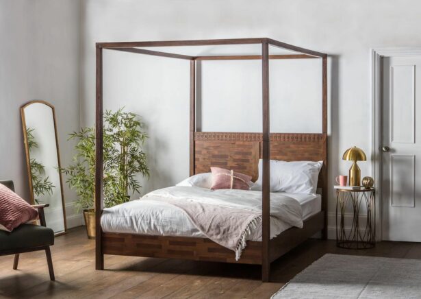
Colour can make or break an interior, influencing the entire character and feel of the space. For example, neutral colour schemes create the illusion of more room, increase productivity, and restore calm. This can be easily accomplished by choosing complementary and balanced colours.
The 60/30/10 rule:
If you want to create a harmonious, balanced environment, try this simple formula.
- Decorate 60% of a room with a dominant colour Choose a neutral shade.
- Decorate 30% of a room with a secondary colour. Choose a brighter colour that compliments your neutral shade.
- The last 10% should be used as an accent colour. Choose a ‘pop’ of colour that compliments your dominant and secondary colour. This last 10% can be split into two colours if complementary to the overall scheme.
Colour associations:
Choosing the right colour combination
RED
Red makes a room come alive, sparking passion and a sense of excitement. In a living room or dining room, it draws people together and stimulates conversation. In a hallway, it creates a strong first impression. In dim lighting, red is both elegant and rich.
YELLOW
Yellow communicates happiness and lightheartedness. It is ideal for kitchens, dining rooms and bathrooms, where it is both energizing and uplifting. In small spaces, yellow can feel spacious and welcoming.
BLUE
Blue is often used in bathrooms because it is calming and reminiscent of the sea. It conveys tranquillity and calmness.
GREEN
Green is generally perceived as the most comforting hue and is it is soft and nurturing. In a kitchen, it gives a sense of coolness, while in the living room, it offers warmth and comfort.
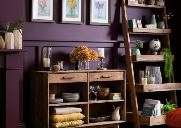
PURPLE
Purple is a rich, dramatic, sophisticated colour associated with luxury and creativity; as an accent colour, it adds depth to a scheme. Lavender and lilac both have the same restful effect that blue does, without the added risk of feeling too chilly.
ORANGE
The colour Orange suggests excitement and enthusiasm and is a particularly suitable hue for a gym. It is a bold, vivid colour, bringing out high-level emotions during a workout and boosting the flow of adrenaline. Orange was historically believed to boost the lungs and better circulation.
NEUTRALS
Decorators’ toolkit includes neutrals such as black, grey, white and brown. They fall in and out of favour, but the virtue of all-neutral schemes is that they are flexible: you can add colour to liven up or subtract it to calm things down.
BLACK
It’s best to use Black in small doses as an accent colour. Indeed, some experts say every room needs a touch of black to ground it and give it depth. You can find the right colour based on the colour wheel, the interior designer’s most and most helpful tool.